Anyone who has planned a home remodel knows color can be intimidating. While flipping through paint swatches in the hardware store, many questions arise: Will this color look right in my space? Will I get sick of it? Will it stand the test of time or become outdated?
In the commercial interior design world, these fears and concerns are just as relevant. Although most owners want a lively, sensory-rich space, they want to maintain a sense of timelessness. Color can feel risky.
We’ve guided many clients through this conversation, helping them balance the desire for color with other considerations. This article will prepare you for your project by discussing how to incorporate color into a commercial space and some alternative options.
5 Tips for Using Color in Commercial Interior Design
1. Lean Into a Concept, Not Trends
Colors go in and out of style. While beige interiors were all the rage in the 2000s, gray dominated the next decade. Social media has sped up this trend cycle, with colors like Millennial Pink and Gen Z Yellow enjoying brief viral fame.
Although trendy colors can feel tempting, they rarely stand the test of time. Rather than trends, base color choices on your organization’s identity. A clear concept—a guiding theme or idea—should determine how you incorporate color into your space.
Pella Early Learning Center is a recent project that shows how a concept can guide color selection. Although the school district wanted a colorful, playful space, we didn’t want an arbitrary palette.
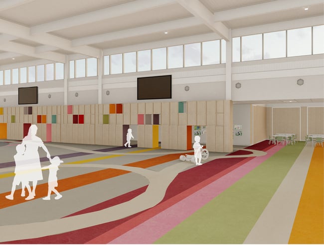
Color choices at Pella Early Learning Center are inspired by tulip fields.
Inspired by Pella’s Dutch heritage, we developed a concept based on tulips. The striped patterned flooring in the multipurpose space mimics tulip fields, with colors repeated on the play wall.
Similarly, in our Iowa City studio, we developed acoustic wall treatments for our four focus rooms. The rooms are named after Iowa City neighborhoods, and the wall treatments’ color schemes reflect the neighborhoods’ landscapes and architecture.
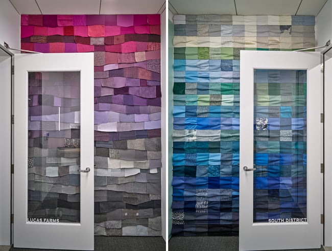
Wall treatments reflect Iowa City neighborhoods.
In both cases, color use is meaningful to the location and helps tell a larger story about the organization and its mission. With a clear concept, color choices are less likely to go out of style.
2. Remember the Context
When designing an interior space, imagining the final product can be difficult. Even with photorealistic renderings, it’s hard to visualize how a space will look when filled with people and their belongings.
If you are worried about a lack of color, fear not. People will fill the space with life and color, especially when they can decorate.
For example, teachers are likely to hang posters and student artwork in their classrooms. The best approach is to provide a blank canvas to give them more control. In workplaces, employees are likely to decorate their desks and offices with plants and family photos.
In these contexts, adding too much color can lead to a visually cluttered environment once occupants arrive. A more neutral palette will allow people to express their individuality.
In other contexts, a bold use of color may make more sense. Restaurants and bars, for example, tend to be more atmospheric and immersive. Occupants will not bring belongings or decorations, giving owners more control over the space’s look and feel.
While workplaces and schools should reduce the amount of color, hospitality settings have more freedom to play.
3. Consider Culture and Psychology
Colors are imbued with meaning. When choosing, consider the building’s function and how color choices may affect occupants.
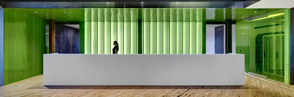
Generally, reds and oranges are high-energy colors, while cooler tones like greens and blues are more calming. Warmer colors may work well for restaurants, bars, or recreational facilities but may not be suited for a school or healthcare facility. Of course, these meanings are cultural, and not everyone will interpret colors the same way.
Warmer colors, like reds and yellows, work better for active environments.
A color’s impact also depends on its use. A room painted entirely in red, for example, will have a different impact than a red accessory. There are no hard and fast rules about color, but your designer should consider the space’s function and discuss the potential impact a color choice may have on occupants.
4. Use Artwork
One way to remove the fear surrounding color is to make it low commitment. While using a more neutral palette on the floor and walls, you can incorporate color through artwork.
Unlike paint or flooring, artwork is easily changeable. Periodic updates can keep your space feeling fresh at a much lower cost than a renovation.
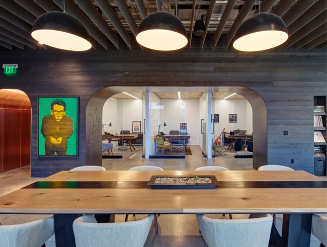
Art can be a low-commitment way to add a pop of color.
Artwork also imbues your space with meaning. Art pieces that reflect your organization’s mission and culture can be far more impactful than painted drywall.
5. Explore Textures and Patterns
Although color may be the most obvious way to enliven a space, it’s not the only option. Your interior designer should help you think beyond color and find other ways to create visual interest.
One option is using patterns—an approach taken at UIHC Forevergreen Road. Traditionally, healthcare settings use color to assist with wayfinding. We aimed to create a calming space free of visual clutter and instead used a more neutral palette. Rather than color, patterns on the walls guide visitors through the facility.
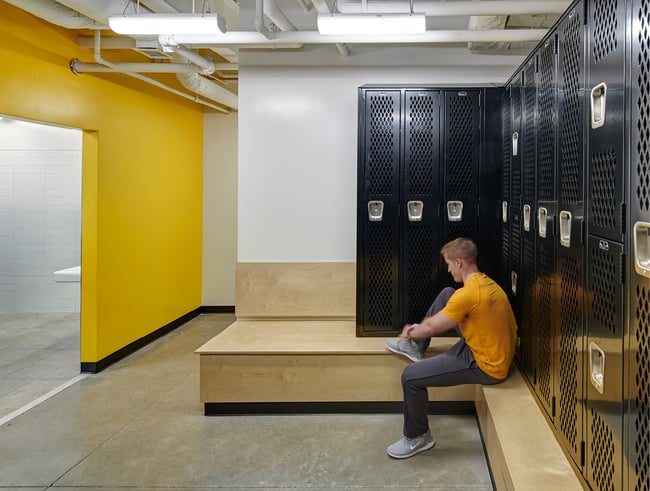
Texture is another option. Using a mix of materials—like wood, metal, felt, and concrete—can create a rich sensory experience without color.
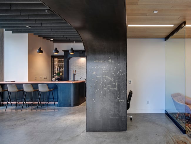
A mix of metal, wood, and glass can create a rich sensory experience.
We took this approach at our Iowa City studio. Instead of color, we incorporated locally harvested ash wood and blackened steel throughout the space. Natural materials like these can create a biophilic experience for occupants while providing a sense of timelessness.
Discover Other Considerations for a Commercial Interior Design Project
Although color is an effective way to add life and personality to a space, it presents risks. Leaning into a color trend can date a space quickly, and using too much color can create visual clutter in some settings.
Our recommendation is to base your color choices on your organization, mission, and brand. Your interior designer should work to understand your organization and develop a concept that fits the building’s function.
They should also help you explore options beyond color, including texture and pattern. Often, these solutions can create a much richer sensory experience than paint.
Furniture is another way to add a pop of color to your space. When selecting furniture, remember to balance its visual impact with durability, ergonomics, and cost. Learn more by reading about our tips for selecting furniture for a commercial building project.